

Original link: https://mp.weixin.qq.com/s?__biz=MzYyNDc4Mzc1MQ==&mid=2247486014&idx=1&sn=04e6e424df726c8fecdbb31ed657fccc&chksm=f1de7dbe50a842d6afd03be62a2bf938c75fd8c13b397955949d373ec3370f96d7912bad0bef&mpshare=1&scene=24&srcid=0430nIZzBiQto9eTCaiaHaDk&sharer_shareinfo=4bb8831d1f6710546758196e4b1c088f&sharer_shareinfo_first=4bb8831d1f6710546758196e4b1c088f#rd
The pioneers of e-ink displays probably never imagined this thing would one day be associated with interior design.
If you're still fixated on the "instant noodle lid" property of Kindle, you're seriously underestimating the direction of the current market.
Since the second half of last year, there's been a fascinating trend in the industry: people are no longer obsessed with buying e-readers. Instead, they're flocking to buy e-ink clocks, e-ink to-do boards, and even those tiny ESP32 DIY screens that only show a single line of motivational text.
Can these things read books? No.
Can they surf the internet? Dream on.
But they're trending, they're the epitome of what we now call "office desk aesthetics."
Who cares if these devices are interactive? The only thing that matters now is whether they look the part.
This isn't a technological upgrade. It's a targeted visual harvest.
From "Reading" to "Showpiece": The Transformation of the E-ink Category
Let's look at a few popular products.
1
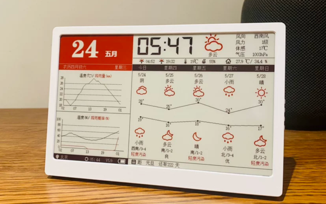
The "Sparks" Multi-functional Smart Calendar Desk is the representative here (the internet sales of this thing are unexpectedly high).
Judging by the specs, this is essentially electronic trash in the e-reader world: a 6-inch screen, 212 PPI, and a refresh rate that causes severe flickering.
But in the context of office aesthetics, it's seen as a physical representation of focus.
Compared to the constant barrage of notifications on our smartphones, this screen, with its 3200mAh battery, suggests a kind of busy but elegant existence.
Besides the "Sparks" model, there's also a 7.5-inch color version from Geek that looks even more vibrant.
(By the way, I'll introduce these two briefly today. If there's enough interest, I'll do a full single test on them, as they are highly customizable and perfect for tinkerers.)
2
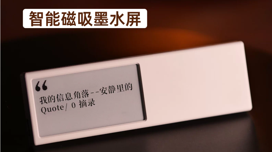
Then there are the DIY quote clocks that are popular among geeks and in the workplace.
These typically use small, black-and-white modules with low resolution, housed in rough 3D-printed or ABS plastic casings.
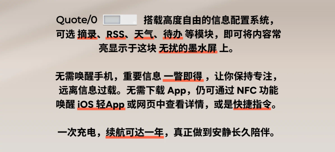
For example, the Quote/0 desk e-ink screen from Shaoshao.
Due to hardware limitations, it has a full refresh cycle of up to an hour, which creates a distinct black flash. But this flaw has become a selling point.
Today's youth eat this stuff up.
The imperfections and the low refresh frequency create a sense of superiority when surrounded by 4K high-frequency monitors.
This "superiority" is simple: in the office space, quality is about the tool, but style is about the impression.
In the past, we chased Carta 1300, 300 PPI, T2000, and oxide backplanes for the best reading experience.
Now, the mass market is chasing low-power, non-interactive visual artifacts.
The Motivation: A "Cure" for Information Overload
When e-ink is completely stripped of its reading function, it actually elevates in status.
It's no longer just a Kindle cover; it's a decorative item for minimalists.
Functionality belongs to tools.
Style belongs to the elite.
Don't think the people buying e-ink calendars are wasting their money. They aren't buying readers; they're buying a remedy for information overload.
So, the next time you see a tiny e-ink screen only showing the date or a quote, don't rush to calculate its cost-effectiveness.
In an era of efficiency, this deliberate inefficiency is a form of spiritual freedom.